Part of my New Year's resolution was to lose weight. I started off well but wasn't really tracking my weight because I didn't own a scale. When I finally got one, I was pleased to discover it could pair with a phone app. However, after downloading and using the companion app, my UX/UI designer mind immediately spotted numerous design opportunities.
Year
2025
Type
Application
Role
UX/UI Designer
Tools
Figma
Research
Competitive Analisys Question
How can we streamline the user flow and improve the product's overall value proposition?
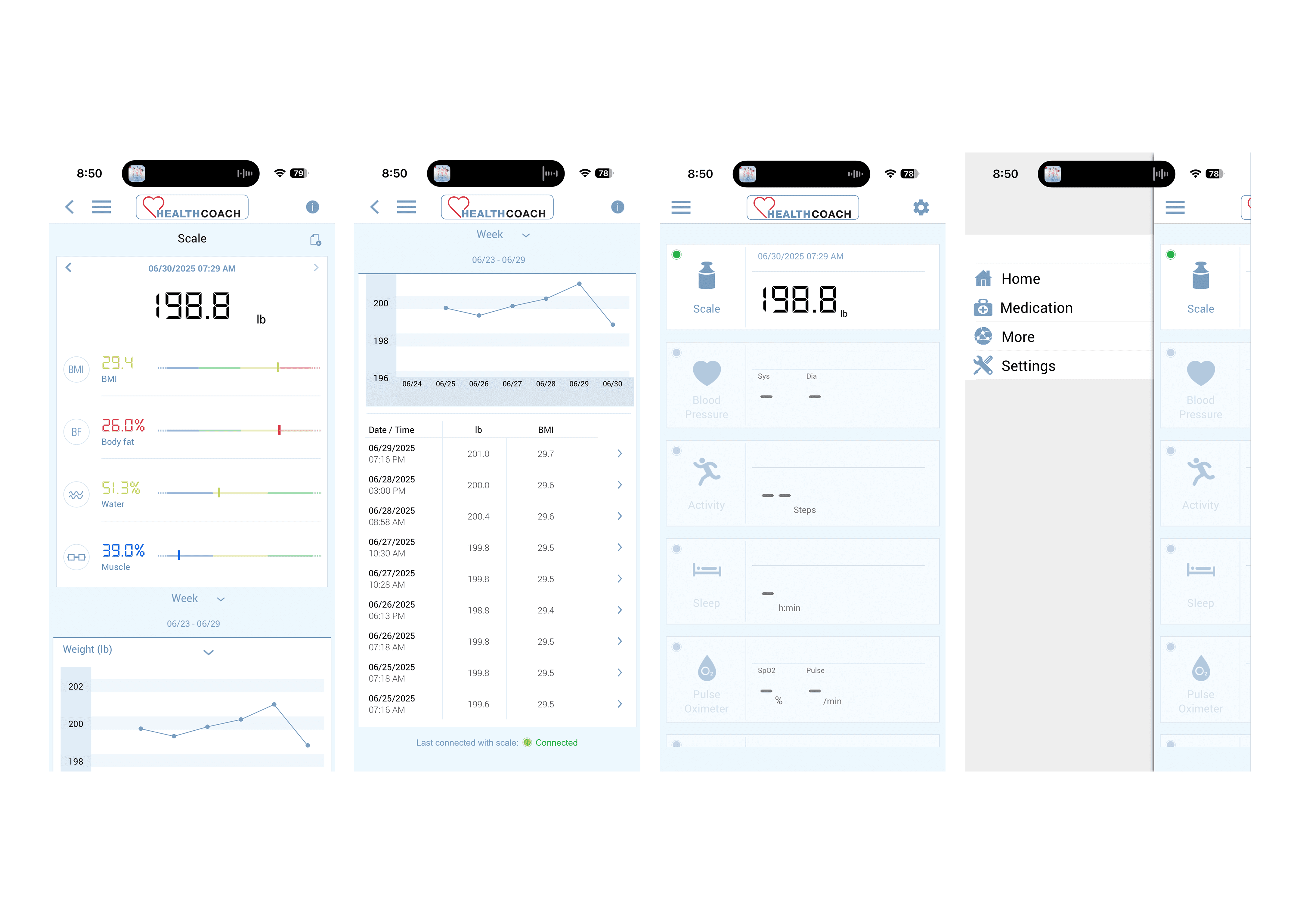
After analyzing industry-leading apps in Health & Fitness and reviewing user feedback on both the App Store and Google Play, I discovered some critical insights:
Current App Performance
2.0 out of 5 stars across both platforms
Primary complaints centered on hardware connectivity issues
Secondary issues included interface clutter and poor information hierarchy
Users frequently mentioned lack of useful functionality beyond basic weight logging
According to users…
"This app is so bad, I no longer buy Beurer products. I purchased a competitor’s blood pressure machine based solely on the Bluetooth app".
"It’s really not fair that you charge this much for something that doesn’t work. You need to update this app".
Industry Benchmarks
Leading apps (MyFitnessPal, Apple Health, Fitbit) maintained 4.0+ ratings
Successful apps prioritized seamless hardware integration and clean UI
Best-in-class apps offered comprehensive health ecosystems, not isolated features
Goals
1
Streamline the User Flow: Reduce friction in daily weight tracking
2
Integrate Health Ecosystems: Connect with popular health apps and wearables
3
Enhance Visual Design: Create a clean, focused interface
4
Add Meaningful Value: Provide insights and recommendations beyond basic tracking
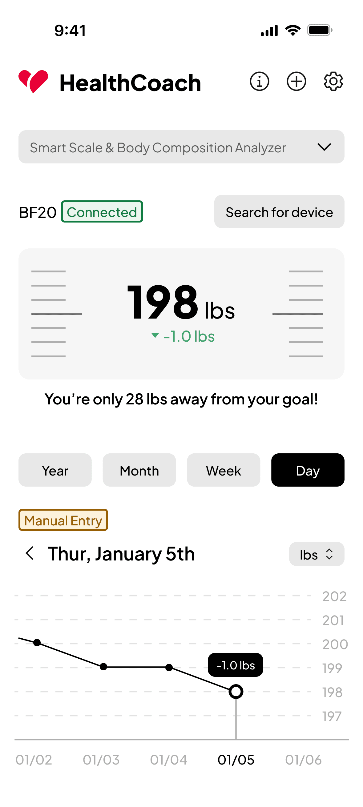
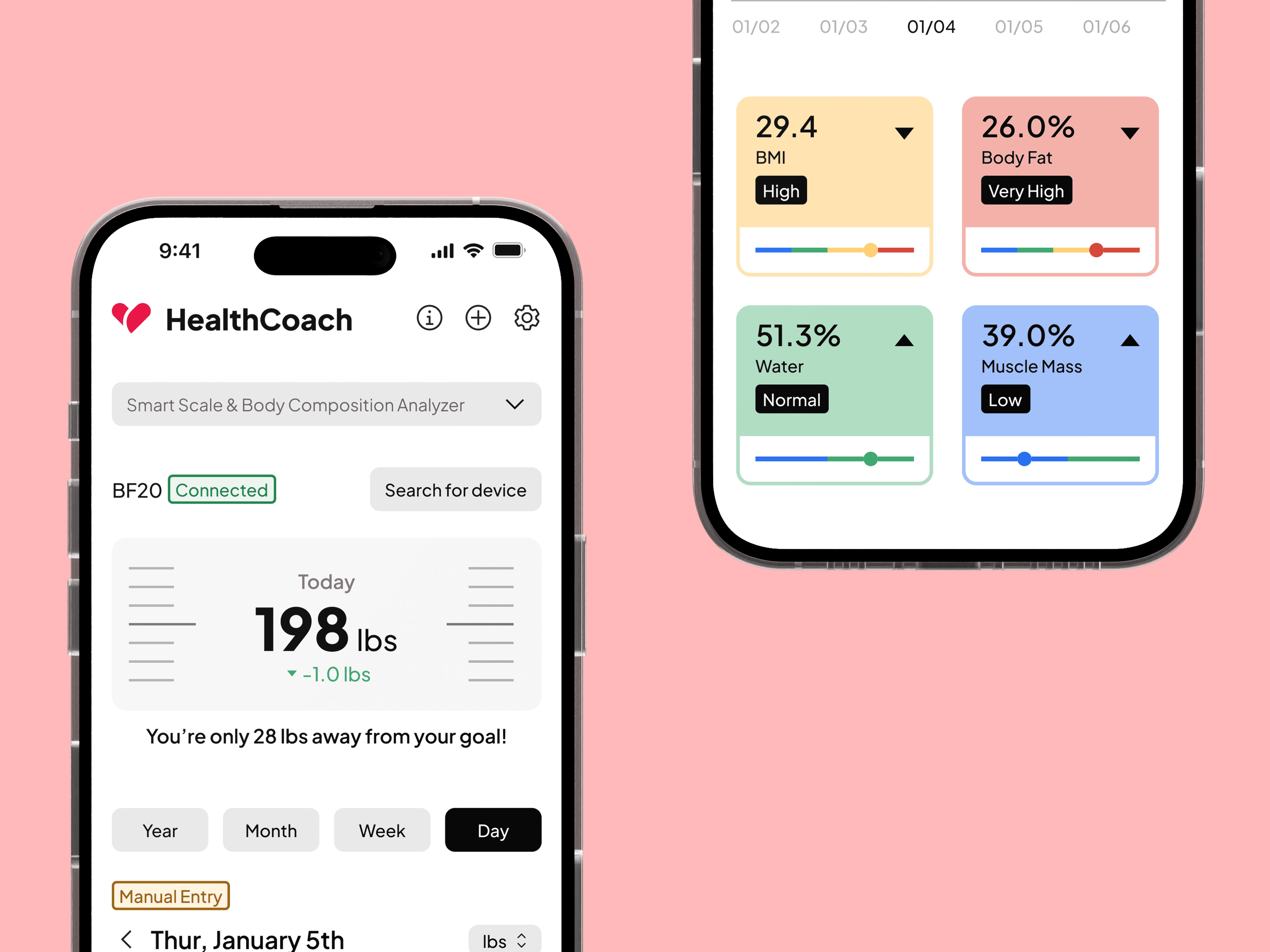
Home Page
The redesigned home screen transforms the cluttered original interface into a clean, user-focused dashboard.
Body composition metrics (BMI, Body Fat, Water, Muscle Mass) are now presented as digestible cards with color-coded indicators and progress bars, replacing the overwhelming data dump.
This approach makes complex health data actionable while directly addressing user complaints about interface clutter.
Connect Your Scale
Streamlined the device connection process by adding a direct "Search for device" button on the home page. Previously, users had to navigate through multiple screens (secondary page → settings → devices → device selection → search), creating unnecessary friction.
This single-tap solution reduces the connection flow from 5+ steps to just one, directly addressing user frustration with the app's cumbersome navigation, a key contributor to its 2.0-star rating.
Manual Weight Entry
Designed the youth ministry's digital home, creating an engaging experience that resonated with younger audiences while maintaining Elevation's brand consistency.
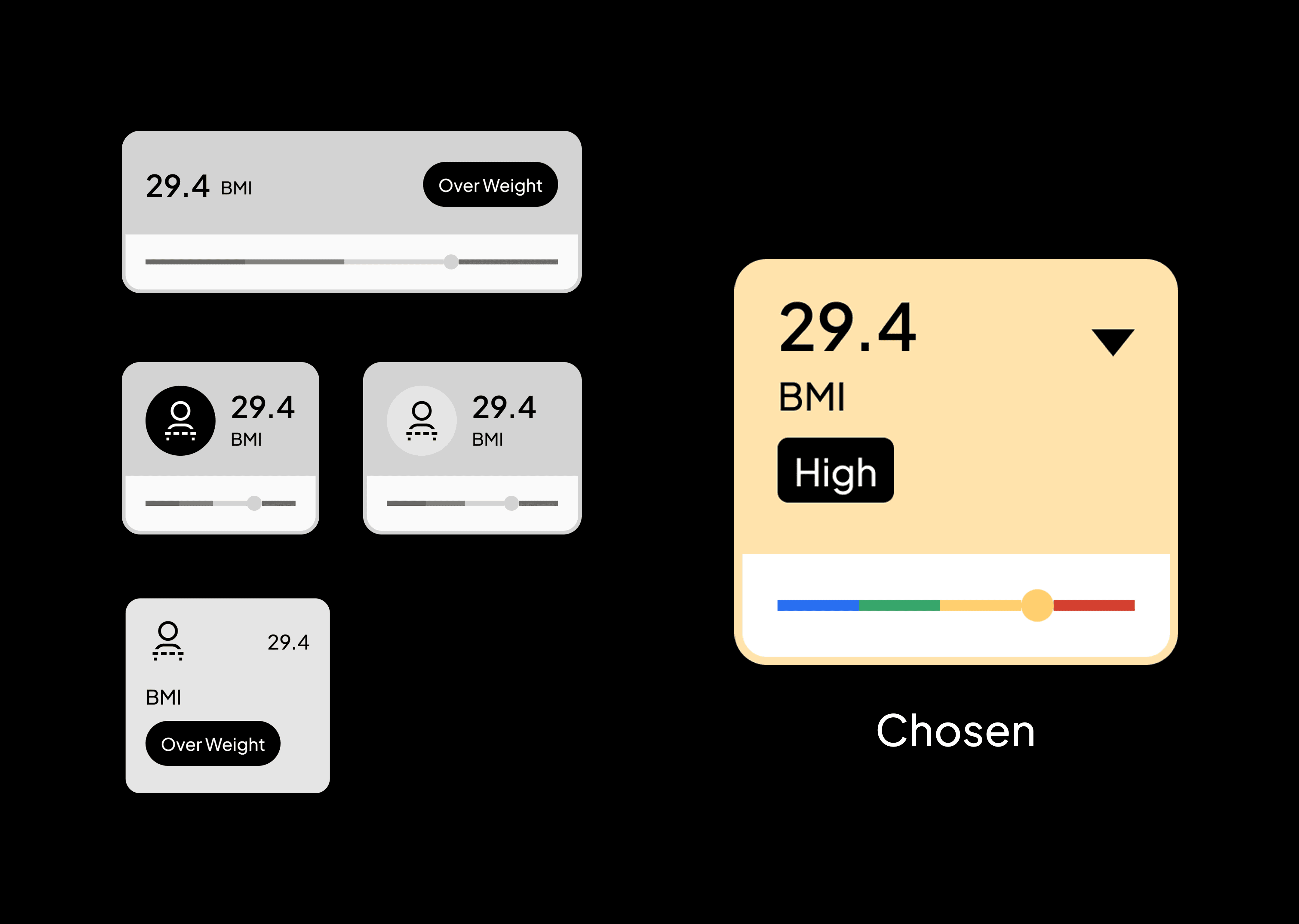
BMI & Health References
Redesigned the reference tables to prioritize user context and responsible data presentation. The new modal includes a prominent CDC/WHO disclaimer at the top, while interactive highlighting shows users exactly where their current metrics fall within the ranges.
This transforms static medical data into personally relevant information with cleaner typography and color-coded categories, replacing the original app's overwhelming text-heavy presentation that contributed to poor user ratings.
Progress Chart
Redesigned the weight tracking chart with a cleaner, more intuitive visualization. The new design features simplified time filter chips (Year, Month, Week, Day), clear data points with contextual tooltips showing daily changes (like "-1.0 lbs"), and a streamlined interface that makes trend tracking more digestible.
This replaces the original app's cluttered chart view with a modern, user-friendly visualization that helps users quickly understand their progress at a glance.